2024's new design trends
Today we’re going to explore 2024’s design trends, and how to apply them in combination with your personal brand’s values. I have to say that (unusually!) I’m pretty taken with these new trends – partly because I think they match up well with the kind of style I most like to work with, and that best reflects the value of connecting up your message with your visual identity.
What are these new trends about?
Graphic design is once again starting to explore creativity in a more experimental and expansive way – leaving behind minimalism (which took us down the road of the tendency to conform and often forgot to work on the message behind the brand). Having a strong visual concept and captivating storytelling is the most solid thread a brand can have running through it right now.
Beyond that, as I explain later in this post, I think paying attention to sustainability is a must in the climate emergency we’re living through. It’s really important that it features in 2024’s design trends, as it implies that more and more projects are taking it into account in their corporate values.
Lastly, the appeal to emotional memory and to memories that evoke real feelings creates a more human and intimate approach: we’re not speaking to the world at large here, but instead taking things to a specific audience, an audience with whom we’re in dialogue, and who we want to feel represented by what we’re telling them.
Why pay attention to these trends?
I don’t think these trends are for just any brand in just any environment or with just any audience. Instead, they’re a reflection of what’s resonated most in the last year visually. It might be most accurate to say they’re ‘what was trending in 2023’. They’ve shone through in a sea of visual offerings and experiments and can shed a bit of light on which things are working and which aren’t.
They also give us a chance to see how big brands will be communicating, and what kind of visuals and messages they’ll use to connect with their own audiences. That means we might be able to use the same trends in our identity, where we share an audience with a big brand (or have a similar one). But it also can also work the other way round, allowing us to set ourselves apart clearly from a brand to which we don’t want to be connected visually by showing clear differences to their style:
- For example, say we have a brand of trainers made from 100% sustainable materials and Nike launches a green campaign with products that aren’t entirely sustainable, and runs that campaign with craft paper graphics and a sans serif font. Maybe we want to set our green campaign apart, using different graphics or communication, so it can be clearly distinguished from – or contrasted to – Nike’s campaign in shoe shops.
Lastly, I think these trends are an excellent opportunity to anticipate the changes that are coming in brand communication, and how we can take them into account when reinventing our own identity: to make sure we’re up to date and have space for innovation.
1. sustainability
It seems unbelievable that sustainability needs to be ‘trending’ for us to put it front and centre, but I’m still glad we’re talking about it, and that brands are increasingly conscious of it.
I think it’s incredibly important that our messages are starting to be aware of taking greater responsibility for the environment, as well as for our community and immediate neighbours.
how can i make my brand image more sustainable?
If we think about how we want our brand to be perceived, and the message we want to communicate, we can come up with resources that will help us to build the visual universe we’re looking for. For example, it might be recycling, responsible use of resources, illustrations or photos of natural subjects, eco-friendly materials, or sustainable printing techniques.
In terms of colour, we can integrate brighter, greener, and earthier colours. But use of black is also interesting: if we use monotones with black, we can be more efficient when it comes to printing (as this uses less ink). But if we use a lot of black pure and simple, our brand starts hinting at the colours of petrol and pollution. At that point, it comes down to how we want to see the message: whether from a positive perspective (positive actions for a better future) or a negative one (showing the damage done and creating awareness through a sense of responsibility).
Eco-minimalism can help us resolve the issue of colour as well as giving a sense of being more efficient with resources.
 Branded Stickers for Wrappers by Zukey
how do i know if my brand needs a design reflecting sustainable values?
Mostly, it’s projects whose values and message include care for the environment, saving the planet, or promoting sustainable practices, that are ideal candidates for an image like this.
- Ecological product businesses: if your project offers sustainable, recycled, organic, or fair trade products.
- Environmental NGOs: if you’re a group or NGO focused on preserving the environment and sustainability.
- Renewable energy businesses: if your business is working to develop or produce renewable energy and green technology.
- Sustainable fashion brands: if you’re a fashion business making an effort to follow sustainable and ethical practices.
- Education organisations with an environmental focus: if you’re a school, university, or educational programme that prioritises environmental education and sustainability.
- Green tourism businesses: if you’re focused on offering tourist experiences that respect the environment and local culture.
- Green tech startups: if you’re a growing business developing new technologies to tackle environmental problems.
- Personal brands with sustainable values: if sustainability is one of the main values of your project, building your visual identity in that direction would be a good move. You might be:
- A public personality focused on sustainable practices.
- An educator who prioritises environmental education and sustainability.
- A therapist or psychologist with a strong environmental or social commitment.
- An artist who uses their art to share messages and raise awareness about the environment.
Do you want your brand to reflect sustainable values?
If you have a business, brand, or project like this and still aren’t reflecting your brand values or clearly expressing your message in your visual identity, it’s really important that you start to bear this in mind, that your audience knows your business has a strong commitment to the environment, the circular economy, or an ecological future. Effective communication around sustainability can be a key differentiator in the current market.
If you want to incorporate this style in your brand, or you’re thinking of a redesign, you can contact me here:
Do you want your brand to reflect sustainable values? Get in touch!
2. maximalism
turn up the volume of your designs (and your communication)
I am completely in love with this trend. Maximalism has come to break us out of the universe of conformity. It’s a means of getting out from creative restrictions, opening a wide spectrum of graphic possibilities with a lot of play and colour.
 Shifter Cooperativos by Ricardo Santos
how to make your brand's style more vibrant and bold
A brand with a maximalist style will have strong, vibrant, attractive, stimulating colours. Choice of colour is really important to this trend, as it will be front and centre.
Designs are fully loaded and can seem a bit crazy or random (with elements thrown all over the place). Nonetheless, there’s still organisation, the key phrase for this trend is “Ordered chaos”.
It’s a perfect combination of forms and emotions, drawing a visual narrative through excess.
What do you want to communicate with your design? Do you want it to be attractive at a glance? Are you looking to grab your audience’s attention, make sure they can’t stop looking?
This trends plays with detailed images, optical illusions, disruptive fonts, and highly intricate layouts. It will keep you looking for quite a while.
 End Plastic Waste – Adidas
brands that can use maximalism
This can be a powerful choice for brands that want to stand out by expressing creativity and generating a visual impact.
- Innovative education projects: if you have an educational initiative that looks to stand out and capture students’ attention, maximalism can be used creatively to reflect the diversity and vitality of learning.
- Social and therapeutic organisations: if you work with a social or therapeutic organisation, you could use maximalism in a way that communicates its wealth of experience and diversity of perspectives.
- Sustainable conferences and events: if you create events and conferences related to sustainability and social awareness, maximalism can be a powerful visual tool to highlight the importance and complexity of these themes.
- Sustainable businesses: if your project is clearly focused on sustainability, maximalism can express the abundance of eco friendly practices and ethical values.
- Educational or attention raising projects: if you have a project related to education and social awareness, maximalism could be used to transmit information in a visually rich and attractive way.
- Personal brand of activist artists: if you’re an artist with a social or activist message, and you’re looking to give more impact to your brand’s message.
Want to add maximalism to your brand?
You can bring maximalism into your visual universe as a specific element in your communication, or through a redesign where you’re looking to raise the volume of your brand.
If, for example, we link it to the trend of sustainability, maximalism can express the abundance of eco friendly practices and ethical values in the sustainable design industry.
If you want to incorporate this style in your brand or you’re thinking of a redesign you can contact me here:
Raise the volume of your brand with this style: Get in touch!
3. retro nostalgia
connect emotionally with your brand through memories
This trend is all about evoking moments from the past and the glory years of our youth. It can be based in different eras: the 80s, the 90s, or the early 00s.
The key thing is this: you’ll have to ask yourself what your audience’s nostalgia era is. Then you’ll know which style they feel the biggest connection to.
how to use nostalgia in your brand
Once you’ve figured out your audience’s nostalgia era, you can give your brand that vibe. It could come from geometric forms, minimalist designs, stickers, lines, grainy photos, or analogue camera filters.
Within your visual universe you can include elements that evoke specific memories that relate to what your project is promoting. It could be internet windows and Windows 98, photos or images of elements from the time (radios, microphones), cyber typographies, characters or elements from pop culture, popular symbols from the time (like the MSN emoticons).
Another resource could be aerosol images or stencils, design styles from 70s cartoons. There are also specific textures and patterns you can use like grids, halftones, or cut and torn paper textures.
 Flower Power for lectorium.info
projects that can look for an emotional connection
The nostalgia trend can be used by a range of projects to evoke feelings of familiarity and emotional connection. The intensity of what we’re communicating will depend on the project: it could be something softer and calmer, or much more poppy, youthful, and energetic.
- Projects with a vintage brand: if your brand is aiming to communicate values like authenticity and durability, using vintage design elements to evoke the feeling of quality and confidence associated with the past.
- Educational projects with a retro style: if you’re a designer of books and educational materials with a nostalgic visual style to pull in your students and make information more accessible and memorable.
- Coaches working with artists: if you have a profile that’s aiming to connect from a place of reflection and introspection. Connecting with the roots of the authenticity that inspired us to pursue an artistic career.
- Ecological products: if you produce natural and organic products, vintage and retro designs can fit really well with an ecological brand, working with desaturated colours and illustrated visual elements.
- Therapy professionals: connecting with the past through nostalgic elements to create a comforting space.
- Astrologists focused on personal growth: using an airbrush style can evoke ethereal or spiritual feelings, including introspection and calm.
Adding retro nostalgia to your brand
A Retro Nostalgia style offers a really strong emotional connection, and ensures your audience will feel much closure to your brand, and connects to them from a place that brings confidence.
Connecting this trend to sustainability could bring in clients who value authenticity and emotional connection to sustainable products.
If you want to incorporate this style in your brand or you’re thinking of a redesign you can contact me here:
Connect your brand with your audience’s emotions: Get in touch!

 Branded Stickers for Wrappers by Zukey
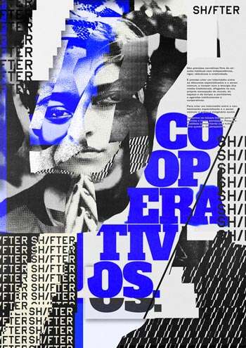 Shifter Cooperativos by Ricardo Santos
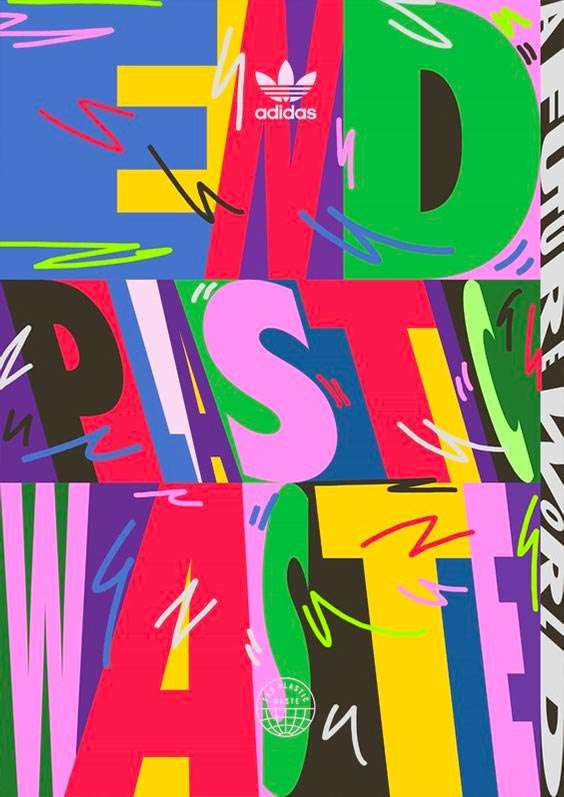 End Plastic Waste – Adidas
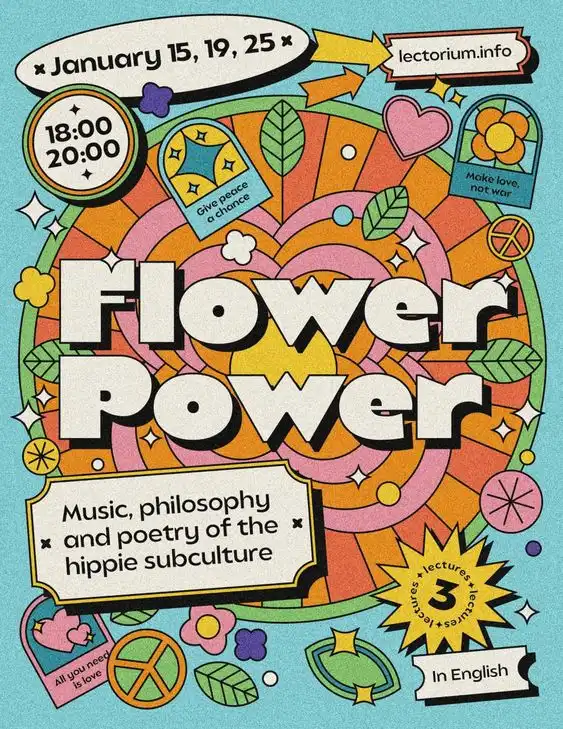 Flower Power for lectorium.info


